For those who need a static site, there are some bootstrapping approaches available: 1) You can start by writing your own CSS file which requires little modification and doesn’t have to be re-compiled from time TO TIME (I use grunt for this).
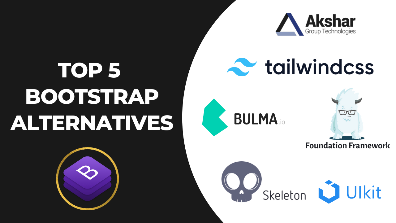
1. Tailwind Css
Tailwind CSS is a utility-first, front-end framework that helps you create modern-day websites without leaving your HTML. It has a variety of classes that help in creating any design, directly to the markup. It has Utility classes that assist in executing within the system limits. It is a customizable, low-level CSS framework that operates based on utility classes.
It has lesser stuff in the CSS bundle and all its utility classes are responsive in nature. It is a component friendly with which developers find it easy to create their own components. Since it is a low-level framework, you can create anything you want to. It becomes simple to create different looks even with the same combinations.
In Addition you can do much more with Tailwind CSS than Bootstrap.
2. Bulma
As one of the popular alternatives of Bootstrap, Bulma is a modernized CSS framework that is free, open-source, and offers competitive frontend components. It needs no prior knowledge of CSS framework and developers can easily create responsive web interfaces. It has a comprehensive flexbox grid, a wide range of colors and helps in building good-looking websites with ease.
Since it is designed with the mobile-first approach in mind, it is 100% responsive. It is modular in nature; you can import whatever you want to. It is considered one of the simplest grid systems. It is rich in components, modular, easy to learn, compatible, well documented, and constantly enhancing. Hence, it is sought after by developers.
3. Foundation
Foundation by Zurb is an advanced responsive front-end framework in the world. It is meant to be effective for any type of medium or device. It assists developers in creating beautiful responsive websites, emails, and apps that work well with any device. It is customizable, readable, and semantic in nature.
There are continuous updates available to garner the latest features of the Foundation. It has major components that a good frontend framework must have – grids, buttons, typography, and major UI fundamentals. It also handles HTML emails with effectiveness through Foundation for Emails.
4. Skeleton
Skeleton is a simple, responsive, lightweight boilerplate and a CSS framework. It consists of a 12-column fluid grid, consisting of rows and columns. It is built keeping in mind the mobile framework. It is easy to start and needs the least compilation. It is best for a small project since it styles only major standard HTML elements and considers a grid.
Whatever the screen size may be, Skeleton considers the layout as the major attraction. It offers basic components for the developer such as lists, forms, buttons, tables, etc. Its grid system fits all kinds of screens – small, medium, and large. There is automatic resizing of column width with a change in one line of CSS. The syntax is easy to implement and hence provides responsive styles in a simple manner.
5. UIKit
UIKit is a modular and responsive framework that is easy to use, and light-weighted. There are many UI components it has, that are either connected with HTML markup or JavaScript code. It can create pixel-perfect web layouts and powerful, fast web interfaces. It consists of a set of files with all major UI components like icons, fonts, design files, documentation, etc.
It offers interoperable CSS pre-processing with Sass or Less. There is an in-built icon library, and it offers support for right-to-left languages. It is quite a simple framework that has a few design components and developers can easily switch between components as needed. It lets the designers go by the modular approach for creating the applications.
Let’s Make Things Happen
Transforming your ideas into reality is our expertise. Share your vision without hesitation, and let our skilled team bring it to life.
“Akshar Group Technologies did such a great job at resolving the initial problem that the partnership expanded to include further development and is still ongoing. Diligent and committed, the team goes above and beyond to deliver their work promptly. They have an extensive knowledge base.”
Digital Engage, US


